Over the last few years, we have been evaluating our fire district, who we serve, and how we can improve by conducting our standard of cover (can be found on our website). We are an all-hazards fire district that handles fires, EMS, hazardous materials, water rescue, and technical rescue. We provide fire prevention and public education programs as well.
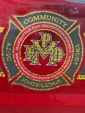
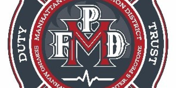
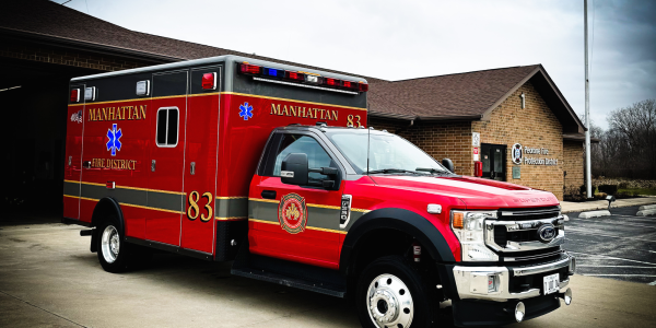
Our new logo displays who we are, what we do, and who we serve with a subtle flame in the background along with a heartbeat to display both fire and EMS. The name of the district and who we serve is now spelled out in the red ring around our newly designed MFPD scramble. The entire logo is encased within an iconic Maltese Cross which incorporate the MFPD’s core values; Community, Trust, Knowledge and Duty. In conjunction with the new logo, we also created 3 other logos using the new logo as the base. The Fire & Life Safety Division utilizes the same logo but with a blue ring that states, Life Safety Through Education. The Fire Prevention Division utilizes the same but with an orange ring that states, Life Safety Through Prevention. Lastly, our apparatus logo utilizes the same base as the new logo but incorporates goldleaf with no flame or heartbeat.
We are proud to share this with the community and will be in the process of rolling out the new identity of the Manhattan Fire Protection District.
